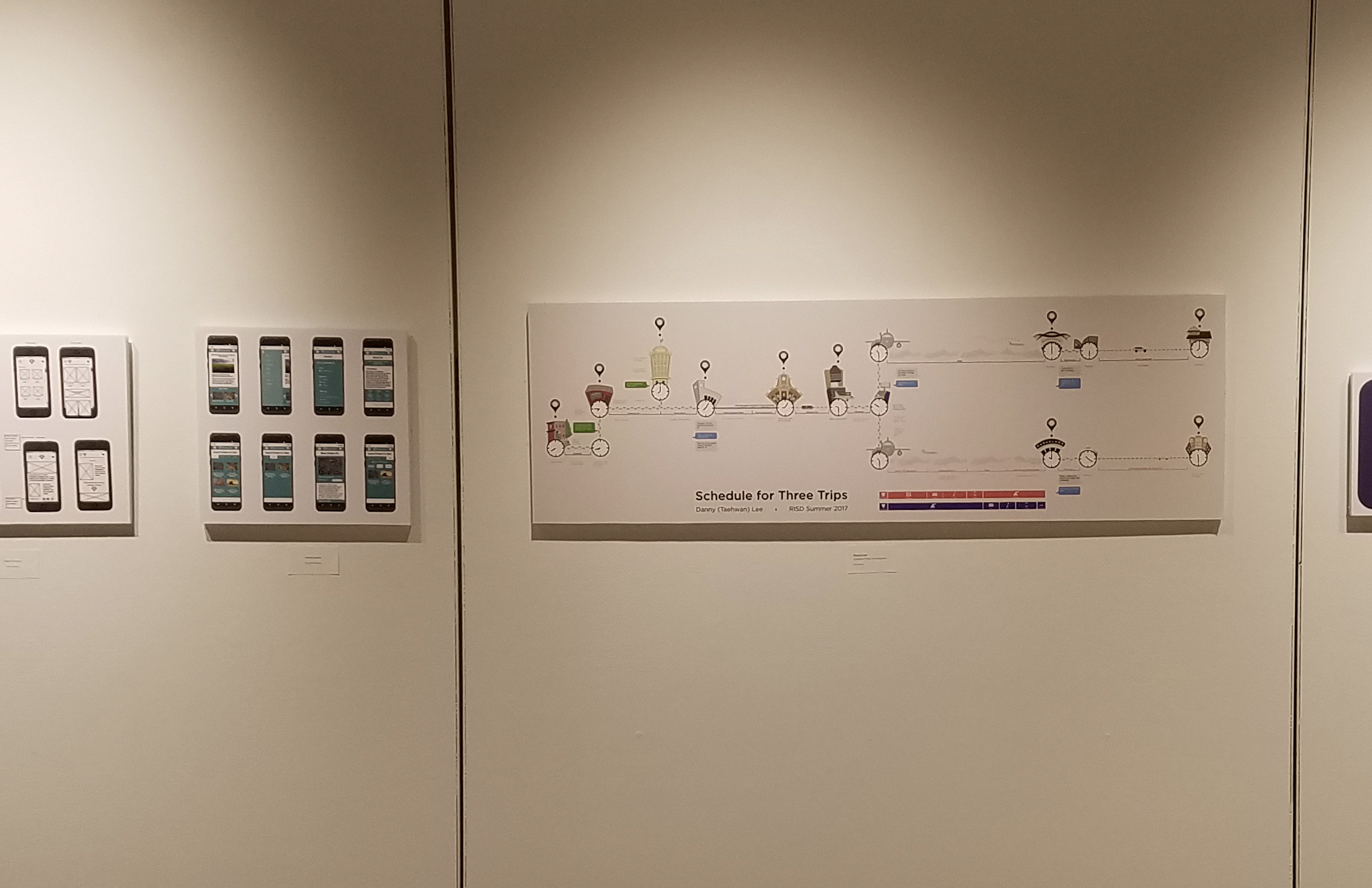
This is the overview of the Infographic. I took a horizonal long layout to make it look like a branching timeline.

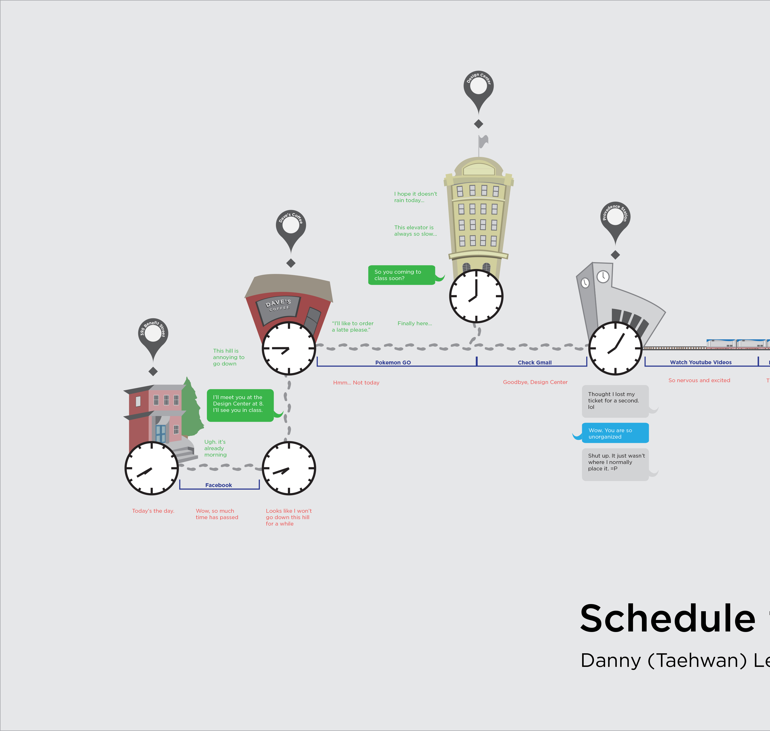
This is a zoom-in on the Infographic. You can see simplified illustrations of where I am going with labels identifying the location.

This is another zoom-in showing the center section. You can see the diversity of transportation utilized in the second
and third trips. On the flights, there are bars on the bottom of the infographic that show what I did on these flights.

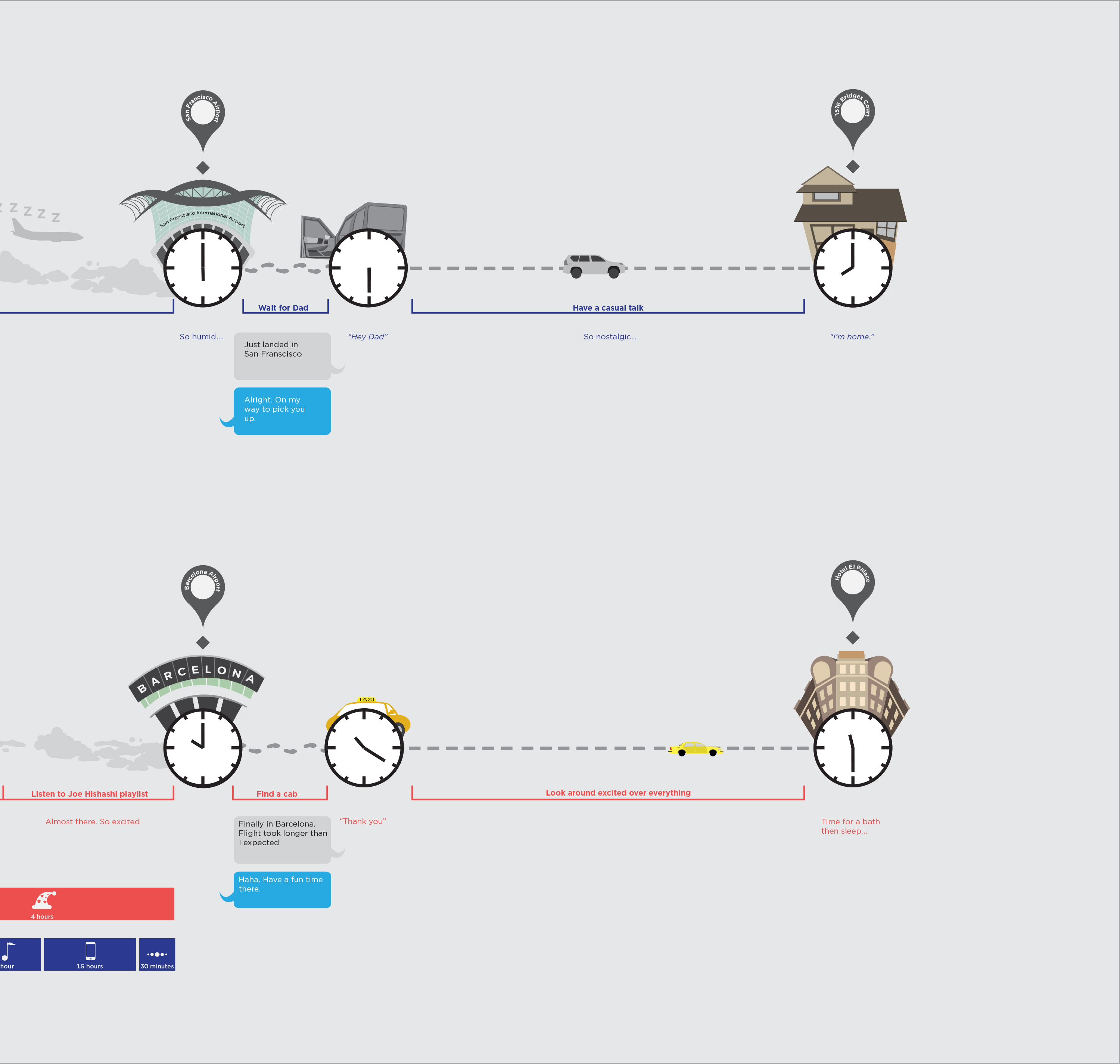
The right side shows the end of the second and third trips. They show how different the end results are.

This piece was on display in the Illustration Department Gallery and the Graphic Design Department Gallery in Rhode Island School of Design.